Keeping it simple with CSS that scales
This is the written version of my new talk, “Keeping it simple with CSS that scales”, which I first delivered at State of the Browser 2019.
It’s a very long read, so I recorded an audio version, too:
CSS has a weird place on the web today. There’s a lot of polarisation, with the opinion being seemingly split on “CSS sucks” and “CSS rules, learn it better, fools”.
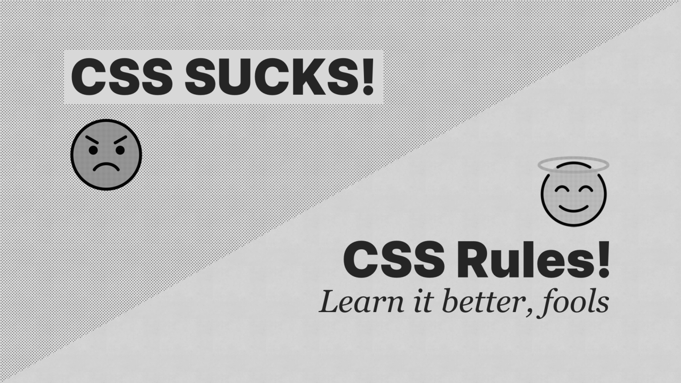
I empathise with the “CSS rules” camp and I’ll explain why: I have a theory as to why the “CSS sucks” camp have the attitude that they do. I think it’s a combination of them over-engineering their CSS, not fully understanding the power of CSS and finally, approaching it like it is a language like JavaScript and expecting it to work in the same way.
What I’m going to do in this piece, is tackle the first bit and talk to you all about how we can simplify CSS to give us incredible power, while also being as low-tech as possible. The secret sauce is that most of the content isn’t actually about CSS, but that’ll all become clearer, later.
Let’s talk about scale permalink

I absolutely hate it when we use the term, “Scale”. I think we are stuck with it though, just like we are stuck with “JAMstack”, “Serverless” and “performant”.

They’re all equally awful words, but one thing they do is create a common, recognisable construct for communication. As much as it pained me, it’s exactly why I named this talk “Keeping it simple with CSS that scales”. You probably knew before I even opened my gob that I’d be talking about working on massive codebases, which at some point in this talk, I’ll get to.

One thing that I do get pissed off about with “Scale”, though, is that gets slightly muddied when people use it as an excuse to over-engineer something.
Let’s take this common example. It usually gets said by some Bay Area tech bro:
We use a CSS-in-JS library because our product needs to scale

Let’s be honest for a moment, folks: most of the tepid guff that these tech bros are making will only scale as far as the bin, so it’s not much of a valid excuse, is it?
I’ll also be bold and straight-up say that I don’t think using scale as an excuse for over-engineering stuff—especially CSS—is acceptable, even for huge teams that work on huge products. Keep that in mind, because I hope, by the end of this session, you’re going to be in agreement with me.
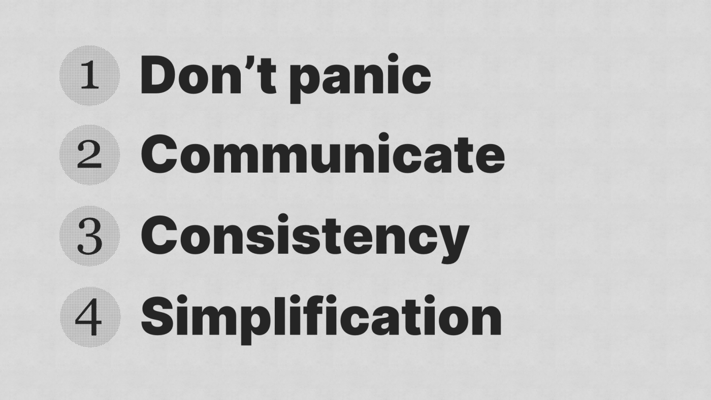
Four key things permalink
I think we can focus on four key things today, and for the rest of this piece, I’m going to run us through them in detail with a little progress thing, so you know roughly how much longer you have to endure me for.
I could package this up as DCCS and really mop up the upvotes on that orange website, right?
Anyway, let’s dive in.
Don’t panic permalink
One of my favourite books is The Hitchhiker’s Guide to the Galaxy. It’s about the earth being blown up to make way for a hyperspace highway and our main character, Arthur Dent proceeds to hitchhike around space with his alien guide, Ford Prefect.
I know, that’s a proper rubbish synopsis, but you all didn’t come here to read me chatting about this book.
The actual Hitchhiker’s Guide to the Galaxy is a sort of interactive encyclopaedia—well, interactive by 1979 standards...
The thing that has always resonated with me about the encyclopaedia is on the cover it says: “Don’t Panic”. The phrase is used so many times throughout the story, even when the context very much calls for panic.

I find myself really resonating with Ford Prefect, guiding Arthur Dent—a bumbling brit through the understandably mind-boggling adventure in space. Ford always approaches challenges in a calm, pragmatic way, just like the guide tells him to: “Don’t Panic”, and I think that’s a takeaway for us too.
In fact, when Arthur first gets the book handed to him, he says:
“I like the cover...‘Don’t Panic’. It’s the first helpful or intelligible thing any-body’s said to me all day.“
Right, anyway, I digress…“don’t panic”. It’s such good advice because when we panic, we make silly mistakes. Think about it: how many horrendous CSS hacks have you made when you’re up against-it in a project and you just needed to get it done.
A lot of people do it and it’s because we’re panicking. The deadline is looming and there’s no time to work out why our CSS is borked, so we throw !important at it until it’s fixed.

This is fine: we all do it, but what isn’t fine is technical debt. Often panic goes beyond a little hack here-and-there and escalates into something much more serious, like employing a CSS-in-JS framework, which is the equivalent of taking out a Wonga loan to pay of your house mortgage.
Incredibly high interest technical debt, which frustratingly, the developers who took it out, only pay a bit off, because that developer has probably already gone and got a new job. It’s mainly the user who takes the biggest hit, in terms of performance, and this boggles my mind when you consider what we have available to us with modern CSS.
The current state of CSS permalink

Really, we’ve never had it better with CSS. We have CSS Grid with 93% support and Flexbox with 98.8% support. Approach using them with a safe progressive enhancement mindset and your layout is sorted. Job done. No worries.
We also get CSS Custom Properties which are native CSS variables. They’re incredibly handy for tokenising our CSS. Because they are also affected by the cascade, we can can override them, contextually. This makes them useful for theming, algorithms and display modes, such as dark mode.
:root {
  --primary: #8e8e8e;
}

.box {
  background: var(--primary);
}

.badge {
  color: var(--primary);
}
These are just a subset of powerful new features, but you can see how modern CSS is an incredibly powerful, effective styling tool. But it can come up a bit short, especially when you do have lots of CSS. So let's look at how we can deal with that.
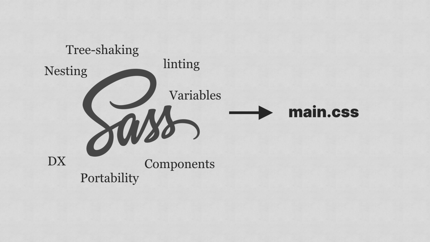
Sass for the win! permalink
All of this native functionality is cool as heck, right? Let’s not forget native nesting too, but who does all of the work when we use that? Yep: the browser!
In most cases, that’s fine, although the thought of native CSS terrifies me—especially when we are already kludging up the browser with heavy JavaScript frameworks.
Basically, what I’m saying is we don’t have to abandon Sass because native language features are coming. It’s probably better to cautiously pre-compile your CSS and not force the browser to work as hard. It’s already working hard enough, re-rendering the DOM every time one piece of data changes (cough reactive frameworks cough), so why make it work harder just so you can have native nesting? It smells like developer experience over user experience to me.

We rush to throw stuff in the bin without thinking about the wider implications. Yeh, we’ll get nesting soon, but how is a low-powered device going to handle 5 levels of nesting with chained selectors? How is a low-powered device going to handle calculating the colour of a Custom Property that has been overridden by the cascade 5 times? It doesn't matter how good the native tools are because if we keep throwing rubbish code at browsers, the users will suffer for it.

The beauty of Sass is that you can have the best of both worlds. You get cool stuff like nesting, but if you do it right, you can get nice, flat selectors. You also get components and if you want, you can set your project up to get multiple bundles. You can also lint your CSS at build time, so you know when stuff is getting out of hand, right in your terminal or GUI.
The most important thing is that with Sass—well, SCSS, you’re writing CSS still. SCSS is smart enough to just do what it needs to focus on and leave the rest of your CSS alone. To me, it feels like a pretty perfect setup.
Communicate permalink
We seem to be in an era where tools and methodologies are dreamed up to help avoid communicating with each other.
Generated CSS class names is a classic example of this. It’s a very typical problem. Some might at this point start having an existential crisis, or dream of machine-generated classnames, but check this out: we’re going to try this novel thing called talking:
Dev #1 - Lucrecia
“This component I came up with already exists. Let me have a quick look in git and see who created it. Ah, it was Isabella”
Lucrecia to Dev #2, Isabella
“Hey, Dev Isabella, is there a reason why this component is called 'block'?”
Isabella to Lucrecia
“Ah yeh, this very important reason. How about you call that component 'box' instead?”
Now this important reason could be anything you dream up:
- A stakeholder decision
- A legacy codebase issue
- A Design decision
Importantly, Isabella, a professional, who knows how to communicate effectively, comes up with an alternative.
Lucrecia
“That’s a great idea. Thanks!”
How wholesome was that?? It’s amazing what happens when we actually talk to each other.

So-called “soft skills” which I prefer to call core skills are shunned in favour of being able to build your own linked-list or do fizz buzz on a whiteboard. This winds me up because to be an effective member of a team, you have to be able to communicate, whereas the only time you ever do fizz buzz in the real world is during that life-draining interview process…
Documentation is everything
Another incredible way to communicate that’s not actual talking is writing. I love writing and you probably noticed, I do a lot of it… In fact, I write almost everything down because I never know when I might need it. It also helps me to commit stuff to memory.
There’s a real value in writing everything down—especially in a large team of front-end developers, writing CSS—or any code, really. You can document your thought-process and explain how and why you’ve done things. You can write documentation, so if another developer picks up your code, they know what’s going on.
By documentation, I don’t mean that you have to write reams and reams of structured docs: I’m talking goddamn comments in your code.
Take this example:
.card {
  background-color: #ffffff !important;
}
If I landed on this I would be like “What the heck is going on here?”
How about this, though?
.card {
  /* When this card is used in the legacy app, there is
  a collision between existing styles, so unfortunately we had to go nuclear. It’s certainly a refactor target. */

  background-color: #ffffff !important;
}
Now if I landed on this, I would be more like: “Huh, fair enough. I’ve got a spare bit of time: maybe I should see if I can work out the specificity issue”.
Good written communication can prevent unnecessary collisions between people, which can in turn, prevent expensive technical debt created by silly tools
A win-win in my books!
Right, enough of me yammering on about how to be functioning adults for a minute, because I’m this far into this piece and I’ve not talked about how to write CSS yet. Let’s do it.
Consistency permalink
I think consistency is key to scaling CSS (sorry I said scale again). Really, this is what these over-abstractions are trying to give you, in my opinion, they just go way too far.
I use a methodology that is sort of a devolution of BEM—a simplified version. I call it C-BEUT, which stands for Cascade, Block, Element, Utility and Token. It’s a proper rubbish name, I know, but it suits the rest of the awful stuff that we come up with for names, doesn’t it? I’ll explain how C-BEUT works.
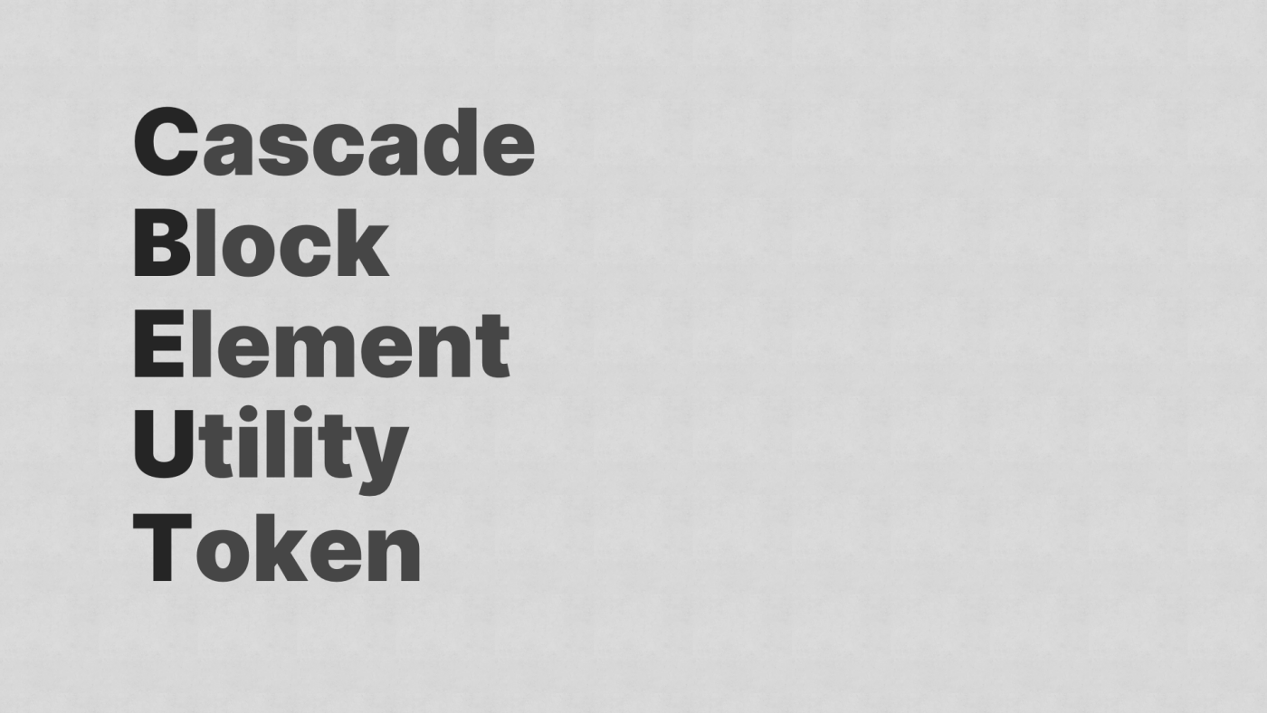
Cascade
The “C” in CSS stands for “Cascading”. Cascade is my favourite part of CSS because if you use it right, you can write very little CSS and get really good results in return. With this methodology, cascade is the first port of call. I set sensible defaults, higher level theming and typography as high up as I can. This gives us so much power.
The components can then be much more skeletal and deal only with how they are different than the globals, rather than dealing with everything.
Block
This is your component, your card or your button. It’s the building block of your user interface. And that's about it really—a construct and nothing else.

Element
This is something that is a dependent of your block—a child element. It always lives in its parent block. A good example of this is within your card, you might have a card__image.

I try to keep the elemental classes as light as possible and use CSS algorithms to distribute content, rather than diving even deeper.
Again, this keeps our component files light and skeletal.

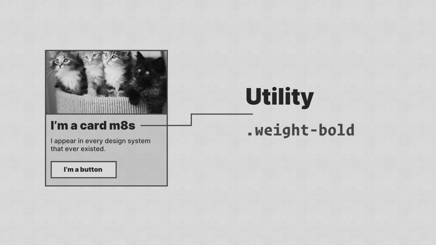
Utility
This is a class that does one job and does it well—like a plumber or a tin opener. An example of a utility class is a one that centers text or applies some top margin. Simple, low-fidelity tools.
Importantly, it means you can write common CSS and apply it where you need it, rather than repeating yourself over-and-over again.
Token
This is actually a utility class, but a specific utility class that implements a design token and is often generated by a separate tool.
What’s a design token? they scream: I’ll let my pal Jina explain them, because they invented them!
Design Tokens are the visual atoms of the design system – specifically, they are named entities that store visual design attributes. We use them in place of hard–coded values in order to maintain a scalable and consistent visual system.
— @jina
These little classes are great for decoupling the scaffold of your UI from the design system. It enables the system to live away from the code context that you are in, which gives it great power.
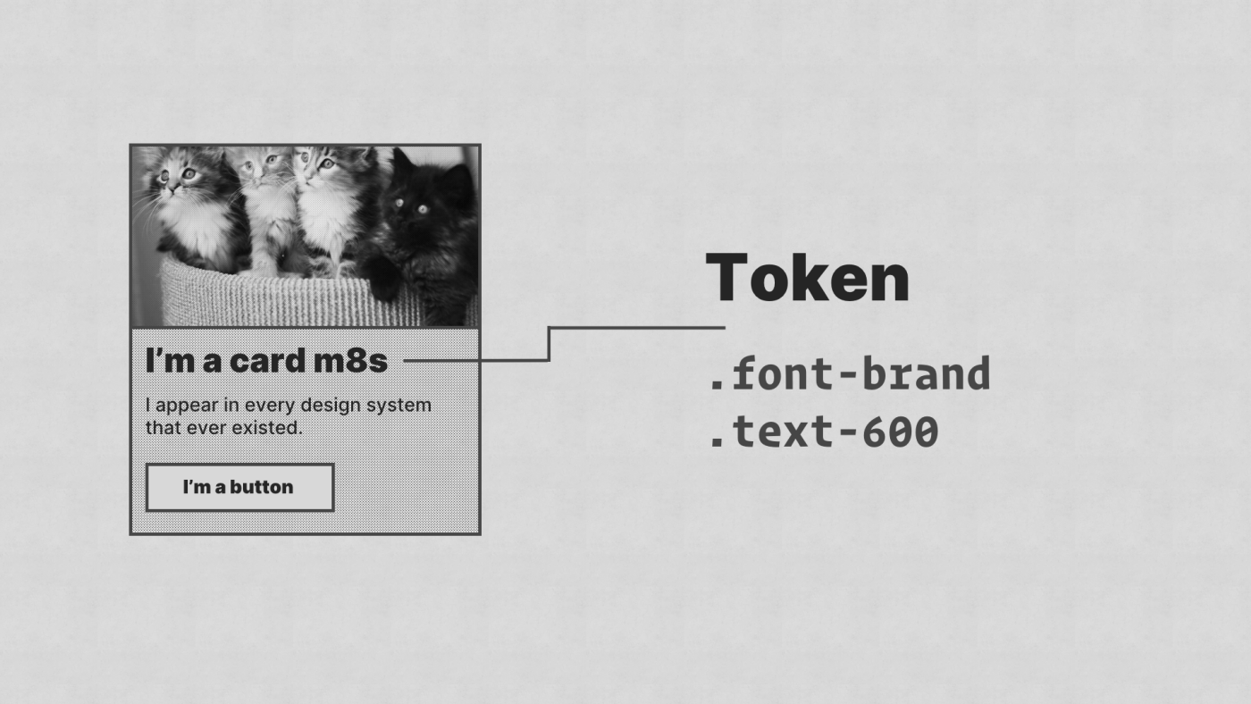
The .text-600 token is a reference to a size scale, just like this one off my website. It uses a major-third scale which gives us that lovely curve between sizes.
It’s used for everything, too:
- Sizing text
- Spacing elements
- Adding inner padding
That’s it really and I won’t sit here, telling you that it’s the best way to write CSS, because it probably isn’t. What it is though is consistent. Just like BEM is or ITCSS is. At the end of the day, find something that works for your team, stick to it and document the hell out of it. Enable people in your team to make consistent decisions without slowing them down.
One thing I will say about methodologies is that if you find yourself restricted by one: invest the time to experiment with something different. Things change, so accept and embrace that fact. It’s why I now use C-BEUT, rather than BEM. I think BEM is amazing, but I also ran into issues where my modifiers were getting out of hand, so I sat back, simplified what I was trying to achieve, and settled on using utilities and tokens instead.
Always be open to change. We live in a dynamic world and work in an incredibly dynamic industry. If you stick to your guns too tightly, you’re probably going to end up causing more problems not just for yourself, but everyone else, in the future.
Simplification permalink
It’d be wild if I did a presentation, titled “Keeping it simple with CSS that scales” and didn’t talk about simplification, wouldn’t it?
Let’s start by talking about frameworks. Do you really need one? I don’t think that you do anymore.

Bootstrap is an incredibly powerful framework. It came at a time when we were learning how to build responsive websites and fighting relentless compatibility issues with browsers. It was a hellish time and Bootstrap, to its credit, made it all much easier. In fact, I’d go as far as saying that by accident, Bootstrap is one of the best design systems ever created.
Using Bootstrap today—when we have actual native tools for layout, such as grid and flex—is like using a sledgehammer to crack an egg. It can also bring complications of its own, too. Because of the way it is built, it uses very global selectors to aggressively set styles. This results in stuff like this again:
.card {
  background-color: #ffffff !important;
}
The same goes for most CSS frameworks to be honest. An example that gives me a heart attack is Tailwind CSS generates over 40 thousand lines of CSS by default (source). Bonkers.
If you have a solid methodology like BEM, ITSCSS, SMACSS or even C-BEUT, you could sprinkle a bit of a grid system with, y'know GRID, add some layout helpers with flex and you are golden.

This is the approach that we took with Every Layout—a book that I co-authored with my good pal, Heydon Pickering.
For our layouts, we find the most robust solution by simplifying and distilling our problem. We then hint the browser, using axioms and rudiments, rather than micro-manage it to allow it to call the shots. This results in a very solid layout system that works upwards with progressive enhancement at the forefront.
It’s been a really cool project and resonated with a lot of people, so go ahead and check it out.
On the subject of progressive enhancement, gather around and take a knee for a moment, everyone.
Don’t dismiss modern CSS because you have to support IE11.
It’s a ridiculous mindset and it pisses me off whenever someone shares a cool trick on Twitter and a Chad will pop into the comments with “WhAt aboUt IE 11 tHOuGh”.

Stop trying to pixel push your designs and instead, use progressive enhancement to create a sensible default that automatically improves where support is available.
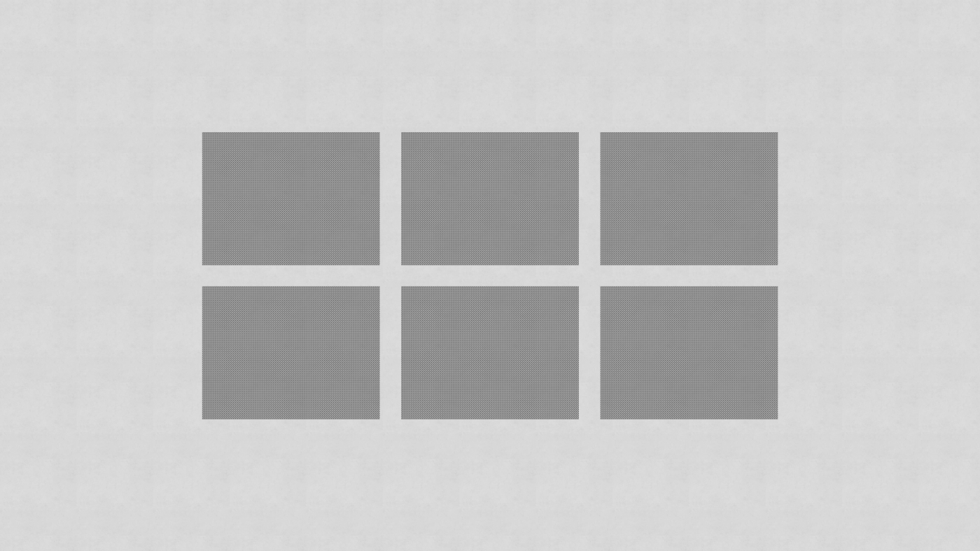
Take this example: we’ve got a good ol’ three column grid. In times gone by, we’d employ some hacks not just to lay it out, but also make it look like this in every browser.
What I propose is that we take a step back, simplify the problem, and find a sensible baseline, and here it is: Good ol’ stacking with space. We can achieve 100% coverage with tiny amounts of CSS now.

This is a handy little grid system that uses minmax to distribute columns. It means we get a responsive grid with no media queries.
.auto-grid {
  display: grid;
  grid-template-columns: repeat(auto-fill, minmax(16rem, 1fr));
  grid-gap: 1rem;
}
But, grid still isn’t quite full supported, but thanks to CSS’s nature, it’ll ignore stuff it doesn’t understand and move on, so we can add this below our grid code:
.auto-grid > * {
  max-width: 25rem;
  margin-left: auto;
  margin-right: auto;
}

.auto-grid > * + * {
  margin-top: 1rem;
}
Now, thanks to @supports, we can reset some of that where there is support. If a browser supports grid, it supports @supports, so job done.
It's 22 lines of CSS, with no hacks and works all the way back to IE9 (and probably beyond).

See the Pen Progressively enhanced, media query-free grid by Andy Bell (@andybelldesign) on CodePen.
Slow down permalink
The last point on simplification and really, the last point of this presentation before I wrap up is “slow down”.
Seriously, slow down. I know it’s hard when you are working sprint-to-sprint or on a massive project, but trust me, when shit hits the fan, just slow down.
I came a cropper to this earlier in the year. I was working on a massive system/pattern library and we were hit with some early complications. What I should have done was stop, stepped back and put some critical thinking in place. But what I did instead was plough on through each sprint, each retro and each planning session until it got to the point where not slowing down had massive negative implications. I was cashing tech debt like I was earning air miles on it.
We had two or three grid systems, some fluid type and some utility driven type that conflicted and a card component that was pretty much a website in itself. If I had slowed down and stepped back, I could have seen these problems, but I didn’t. So seriously, slow down and you will save so much time.
I’ll leave you with this take-home advice: instead of moving fast and breaking things, move slowly and deliberately instead.
You can watch me deliver this talk at State of the Browser 2019, here.
You can see the slide deck from that presentation, here.
Hi 👋, I’m Andy — an educator and web designer
I produce front-end development tutorials over at Front-End Challenges Club and Piccalilli. You can sign up for updates on Piccalilli to stay up to date with its progress.